
Contents
What is it about specific colours that make them feel just right? It’s a question with fascinating answers that go beyond simple aesthetics. In subtle and profound ways, colour reaches into our subconscious, influencing what we buy, feel, and see ourselves.
Let’s explore the subtle power of colour and uncover its hidden role in our daily lives.
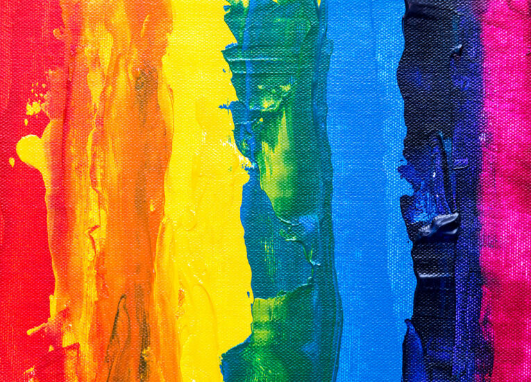
What is Colour Psychology?
Colour psychology studies how colours affect us emotionally and even physically. Ancient cultures believed colours held unique powers that could uplift mood or provide balance. While the science of it has advanced, the essence remains.
Whether choosing clothes, decorating a room, or even playing games online, colours speak directly to our instincts and emotions, shaping our perceptions in ways we may not realise.
For instance, the iconic red and black colours used in roulette games aren’t just eye-catching; they evoke a sense of thrill and anticipation, amplifying the excitement of the game.
Think about walking into a café painted in soft, calming blues or seeing vibrant reds in a fast-food restaurant. These colours weren’t chosen by chance. They bring out specific feelings, like calm or excitement, to make the space feel right. Becoming aware of how colour psychology works helps us understand our daily decisions.
The Psychological Effects of Colours
Every colour has a different way of making us feel. Warm colours like red, orange, and yellow often spark energy, excitement, and sometimes even hunger. That’s why fast-food spots often use these shades—they’re all about energy and quick decisions.
Red, in particular, can increase heart rate and grab attention, which is why it’s also famous for sale signs. Cool colours like blue, green, and purple create a calm, restful atmosphere. A spa filled with earthy greens or peaceful blues will likely feel soothing, encouraging you to relax and unwind.
Green, often associated with nature, can also make us feel refreshed and balanced, while blue tones give a sense of trust and stability.
Of course, the impact isn’t the same for everyone. Some people may find yellow bright and cheerful, while others find it overwhelming. Colour’s effect on us can be surprisingly personal, depending on memories, experiences, and cultural backgrounds.
How We See Colour
What we see as colour is light bouncing off surfaces and interpreted by our eyes and brains. Different colours are made up of different wavelengths of light, and each of these signals reaches the brain, triggering subtle reactions.
Red, for instance, has a short wavelength, causing it to hit the eyes more directly and stimulating an alert response, while blues and greens, with longer wavelengths, are less intense and allow us to relax.
Research shows these signals can cause fundamental changes in mood and energy. Colours like blue and green can even release calming hormones in the brain, explaining why you might feel drawn to a forest’s greenery or the peaceful blue of the ocean. While the science of seeing colours may sound complex, the effects are deeply intuitive.
Cultural and Personal Influences on Colour Perception
Colours mean different things to people, often based on culture and personal experience. In Western cultures, red may symbolise love or excitement, while in other parts, it can mean prosperity or good fortune. Similarly, white is associated with weddings and purity in some places but is linked with mourning in others.
Personal experiences also influence how colours affect us. A person who grew up in a home with soft yellow walls might feel instantly at ease when they see that shade, while another may feel it’s too bold.
Even gender can play a role in colour preference; studies have found that while both men and women like blue, women often lean toward softer colours, while men may prefer darker, stronger shades.
Colour psychology is unique to each person. By recognising how colours impact us individually, we can make more conscious choices in everything from home decor to clothes.
Practical Tips for Using Colour in Everyday Life
Making intentional colour choices can help you set the tone for your environment. For example, if you want to create a calming bedroom, choosing softer hues like pastel blues or greens can make the space more serene. In contrast, using warm colours like orange or red in social spaces can make them feel lively and welcoming.
A common approach for balanced colour use is the 60-30-10 rule. This means using 60% of a dominant colour (often a neutral tone), 30% of a complementary colour, and 10% of an accent colour to add interest. It’s easy to add personality to any space without overwhelming it.
Testing colour choices is also essential. If you’re unsure how a colour will feel, start with smaller accents like cushions, rugs, or decor pieces. You can gradually build up once you feel comfortable with how the shade impacts the room. Trying out different colours and noticing how they affect your mood can make your space truly reflect your personality and well-being.
Conclusion
Colours are everywhere, influencing how we feel, act, and choose. From the shades of paint on our walls to the products we pick up in shops, colour shapes our daily experiences in subtle, meaningful ways. The next time you’re drawn to a specific colour, consider how it might impact your mood or choices. Recognising colour’s effect on our emotions and preferences can empower us to make more mindful choices, creating spaces and styles that genuinely make us feel good.